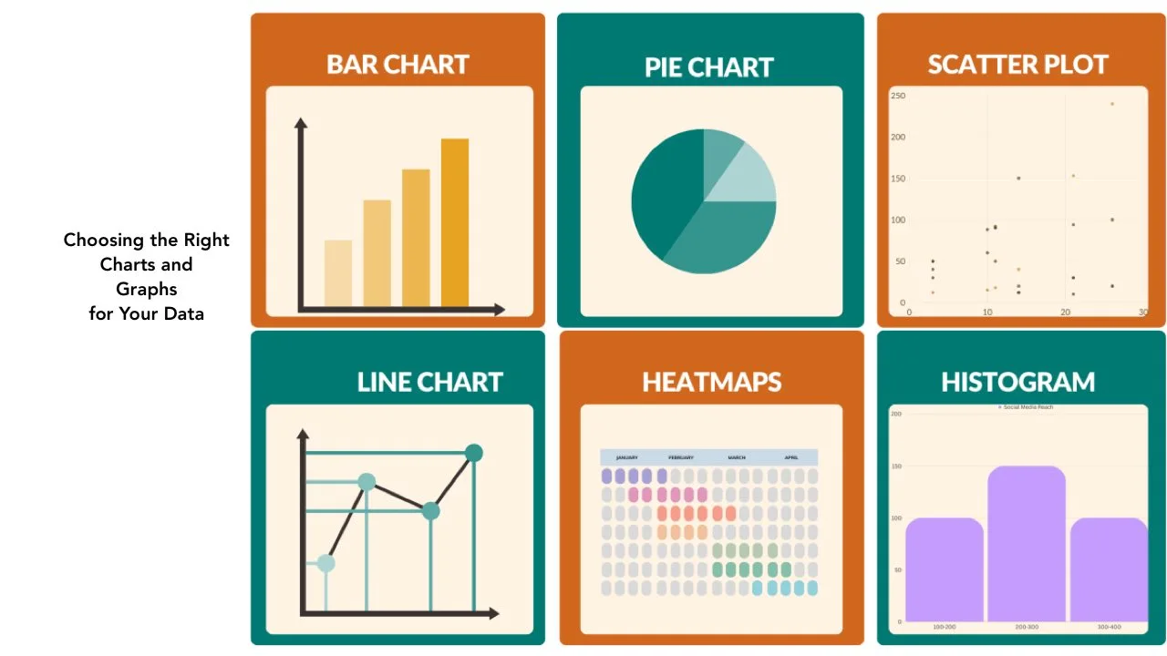
Data visualization plays a crucial role in effective communication. It helps convey complex information in a clear and engaging manner. However, selecting the appropriate charts and graphs can be a daunting task. With a wide array of options available, it’s essential to understand the strengths and limitations of each chart type. This guide will help you navigate the process of choosing the right charts and graphs for your data.
What is Data Types
Before diving into chart selection, it’s important to understand the different types of data you’re working with. Data can be classified into three main categories: categorical, numerical, and time-series.
Categorical Data:
- Represents distinct groups or categories
- Examples: Product types, geographic regions, gender
Numerical Data:
- Represents quantitative values
- Examples: Sales figures, population counts, temperatures
Time-series Data:
- Represents data points over a specific time period
- Examples: Stock prices, website traffic, weather patterns
Choosing the Right Chart Type
Once you’ve identified your data type, you can start exploring different chart options. Here are some common chart types and their recommended uses:
Bar Charts:
- Ideal for comparing categorical data across different groups
- Horizontal or vertical bars make comparisons easy
- Example: Comparing sales figures across different product categories
Line Charts:
- Effective for displaying trends or patterns over time
- Useful for time-series data or continuous numerical data
- Example: Tracking website traffic over a specific period
Pie Charts:
- Suitable for displaying proportions or percentages of a whole
- Limited to a small number of categories for clarity
- Example: Showing the market share of different companies
Scatter Plots:
- Useful for identifying relationships or correlations between two numerical variables
- Can reveal patterns, clusters, or outliers
- Example: Analyzing the relationship between income and spending habits
Tables:
- Effective for displaying precise numerical values
- Useful for detailed data analysis or comparison
- Example: Presenting financial statements or statistical reports
Bullet Point:
- Geographic Information Systems (GIS) data, such as maps or spatial data, may require specialized chart types like choropleth maps or heat maps.
Statistics and Resources:
- According to a survey by Tableau, 92% of respondents agreed that data visualization is crucial for data analysis and decision-making (Source: https://www.tableau.com/learn/articles/data-visualization-survey-report).
- A study by the University of Massachusetts found that people can process visual information 60,000 times faster than text (Source: https://www.umass.edu/newsoffice/article/new-study-shows-human-brains-process).
Remember, chart selection is not just about presenting data; it’s about telling a compelling story. Choose charts that align with your message and resonate with your audience. Additionally, consider factors like chart readability, color schemes, and labeling for effective communication.
